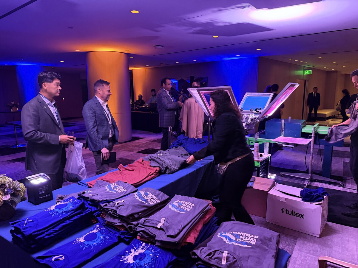
Nearly every bad moment at a live printing activation traces back to a file. The logo that was a screenshot. The Pantone nobody checked against the garment. The version marked final that was not the version anyone approved. None of it surfaces during planning — it surfaces at 6 p.m. with a line forming.
A disciplined onsite t-shirt printing artwork approval workflow removes most of that risk for about two hours of work spread across three weeks. Here is the version we run, and the specific decisions that have to happen at each stage.
The dates that anchor everything
Work backward from the event.
- 4 to 8 weeks out: booking confirmed, print method chosen, product list set. Method matters here because it constrains the art, not the other way around.
- 3 weeks out: first proof round. Also the hard deadline for anything involving custom patches or chenille, which take about three weeks to produce.
- 2 weeks out: second round, if needed. Sponsor and partner logos must be in hand.
- 10 business days out: artwork locked. Files go to production — transfers printed, screens burned, name templates built.
- Event week: physical sample review if the job warrants it. No new art.
The lock date is not a formality. Past it, screens have been burned and transfer stock printed. Changes are possible, but they cost money and someone has to decide that consciously.
Name the person who can say yes
The most expensive thing in this workflow is not a reprint. It is a committee.
Before the first proof goes out, name one approver and put them in the contract or the kickoff email. Not a team, not a distribution list — a person, with a phone number, who has authority to accept a proof on behalf of the brand. Everyone else gives input to that person before the proof round, not during it.
Signs you have a problem: proofs coming back with conflicting notes from two departments, a legal review that nobody scheduled, or a sponsor whose brand team you have never spoken to directly. Each of those adds a week. Surface them at kickoff, when a week is available.
What production actually needs
Send these and you will skip a whole round:
- Vector art (AI, EPS, or PDF with outlined fonts) for anything with clean edges — logos, wordmarks, line work. Screen printing effectively requires it.
- Raster at 300 dpi at final print size with a transparent background, for photographic or full-color art going to DTF.
- Fonts outlined or supplied. A missing font substitutes silently and looks almost right, which is worse than looking wrong.
- Stated print dimensions in inches. “Big on the front” is not a size. A standard adult front print is roughly 11 to 12 inches wide; left chest is 3.5 to 4 inches.
- Color called out as Pantone or as specific values, per garment color.
What does not work: logos pulled from a website, files embedded in a slide deck, or a PDF someone exported from a document at screen resolution. If that is all you have, say so at week four and budget for a redraw.
Where color goes wrong, and how to catch it
Color is the failure mode that survives every other check, because everything looks fine on a screen.
Screen printing hits a specified color most accurately, since the ink is mixed to it — but each color needs its own screen and setup, so a four-color design is a different job and a different price than a one-color design. Adding a color after the lock date is a real production change.
DTF handles gradients, photos and full-color art without extra setup, which makes it the default for live activations. The tradeoff is that a brand color is being reproduced from process inks and will land close rather than exact. Also, DTF on a dark garment prints over a white underbase, and a light brand color can read slightly cooler than it does on a monitor.
The catch is simple: ask for a physical sample on the actual garment color before the lock date, whenever brand exactness matters. A photo of a print is not a sample. If a sample is not in budget, at minimum approve a mockup that shows the art on the correct garment color at the correct size.
Approve templates, not just designs
Onsite printing usually includes something that changes per guest — a name, a number, a team, a date, a design chosen from a menu. Those elements need their own approval, and planners routinely forget.
What to lock:
- The template. Font, size, placement, and maximum character count for the variable field.
- The overflow rule. What happens when someone’s name is 19 characters. Decide now: shrink, truncate, or two lines.
- The menu. If guests pick from designs, approve all of them, and cap the count. Six to eight options is the practical ceiling before intake slows down.
- The content policy. If guests type free text, agree in writing on what the crew declines to print. Give the crew a rule, not a judgment call.
Our activation checklist covers the run-of-show side of this, and best products for onsite printing covers how garment choice changes what art works.
One more approval nobody schedules: somebody has to confirm you can print what you are printing. Sponsor marks need the sponsor’s current brand file and written sign-off. Licensed properties, team logos and university marks need actual permission, and the answer is often no, or yes with conditions on placement and size.
Put a single line in the kickoff notes: who confirmed rights, and when. It takes a minute and it is the item most likely to stop a job cold at week two.
Start the approval clock early
If your event is inside eight weeks, the artwork conversation is the one to have first. Send us your files and the product list and we will tell you what is usable, what needs redrawing, and where the real deadlines fall. Start at the quote form or call (562) 614-4800.